Tuesday, 18 November 2014

What If Metropolis: Colour comps

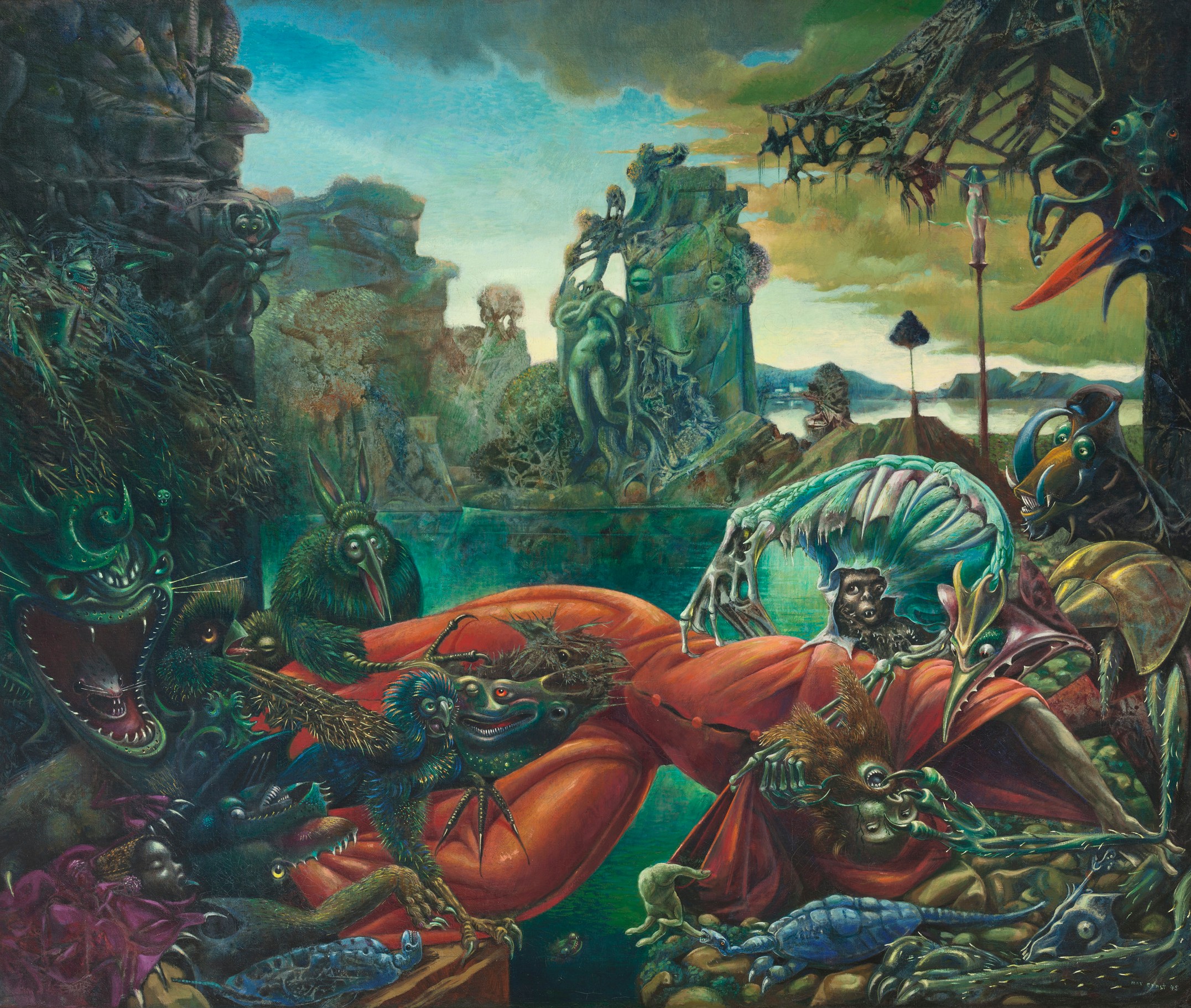
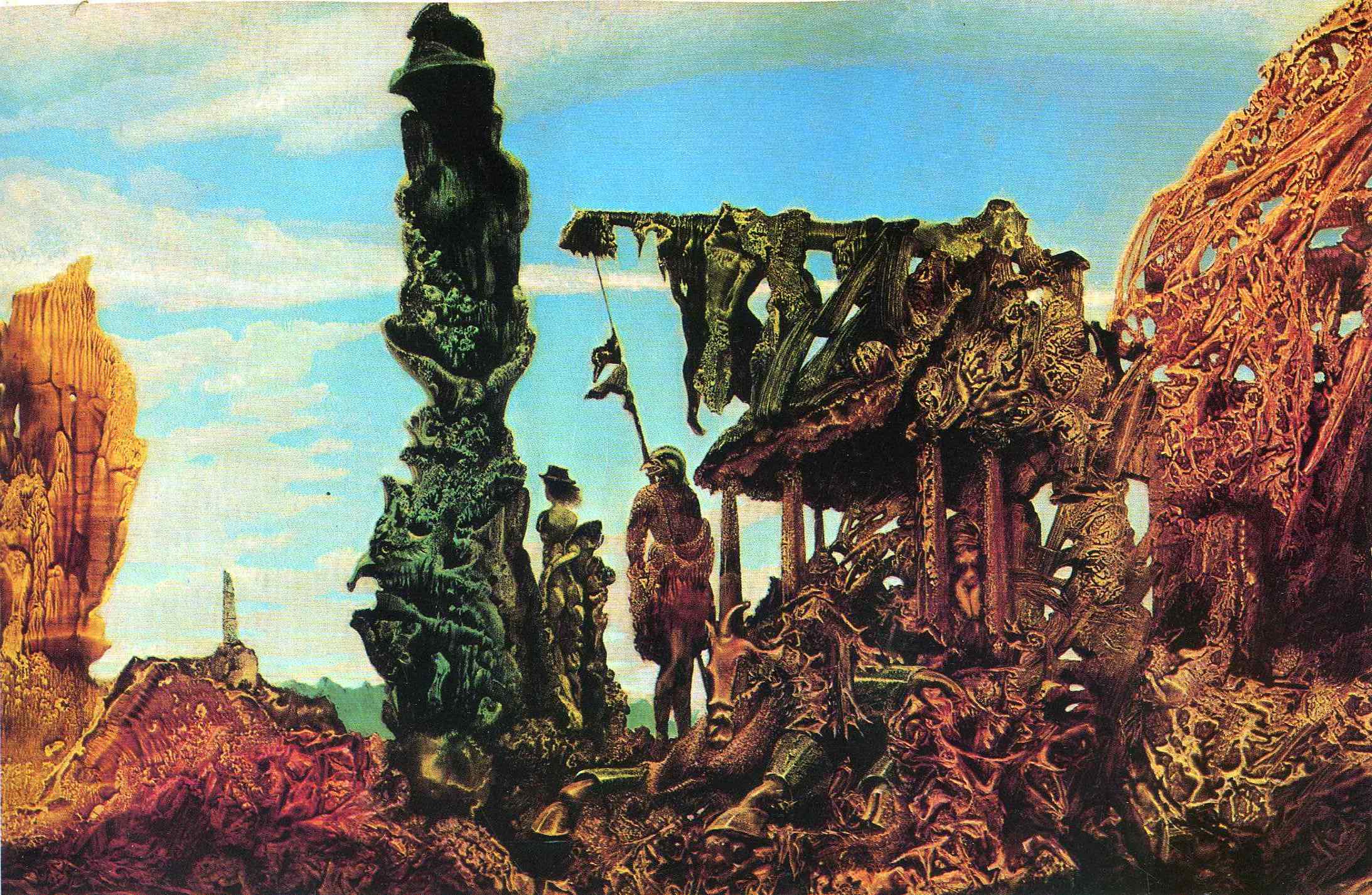
Following Phil's advice I changed around the composition of number 7 from my last page. I made the clock less central and made the rock at the front smaller. I also wanted to test which colours derived from Ernst's work would fit best for my city. 


Composition wise I like 1 best. I feel like keeping most of the middle third empty gives a feeling of absence to my city much like some of Ernst's paintings. I also like the colour of 1 best though I could possibly add some red and orange to help balance out how green it is. 
Share:

Monday, 17 November 2014

Sunday, 16 November 2014

What if Metropolis: Key asset thumbnails


I did some thumbnails for what I thought could be key assets for my city. I quite liked the idea of a clock tower and a bath house (Inspired by aquis submersus) in my city. From previous thumbnail sheets I felt like the green colour scheme was working partially well. 1 from the clock towers is my favourite and I think 2 or 3 would work best for a bath house though thouse blocky looking buildings are going to have to go! I want to design some buildings and set up some compositions tomorrow, I think fitting them to suit the first colock tower will make my work interesting.  
Share:

Thursday, 13 November 2014

What If Metropolis: City ideas

 I really want to push one of these ideas that I now have for my city. 

The first is to create a mix of the structural work ernst does with the most organic work he creates. The city would be built into and around the organic looking structures.

The second is to use only the organic paintings to influence how my city looks, creating buildings from them. 

I quite like both ideas but I'm stuck on whether to include both types of Ernst's work or just the one, feedback is appreciated because I want to sort out my composition and key assets asap!

Share:

Wednesday, 12 November 2014

What if? Metropolis: Thumbnails 105-136

I tried to create more thumbnails again using Ernsts colour schemes and looked at using texture to create thumbnails. I also tried to look at possible more structured buildings for my city, I looked at Ernst's work and also somewhat looked at Italian and Greek architecture. 


Though I liked the way the structures look I didn't like the colours, I think some of them need toning down.


I carried on with the textured work because I felt it was a sucessful way of working.

Share:

Monday, 10 November 2014