Thursday, 25 September 2014

Influence maps for Invisible cities

Here are the influence maps I put together in relation to the invisible cities brief. I've tried to create general maps that can be used to influence all the cities. I'm hoping as I progress and find cities I like that I'll make more maps for those cities in particular.  


This is the first map I made I tried to think about the city that I wanted to create. The 3x3 image in the middle is to represent that I'd like to aim for creating a romantic, pastel type city. The two 2x2 images represent Venice and Italian architecture. Venice is one of my favourite cities and I noted that it also has canals which a few of the cities mention. Venice made me think of Italian architecture and it could be nice to include it in my city. I also have canals, pillars and bridges on my map because they're mentioned in a few of the cities. All the 1x1 spaces are taken up by fictional cities I'm fond of and inspired by. Radiant Garden (Kingdom Hearts) was added for its interesting structure and pastel colours, Kings Landing (Game of Thrones) was added for it's grandness, Candy Kingdom (Adventure Time) was added for it's colours, Tokyo-3 (Evangelion) was added because I like the adaptive nature of the city, it's futuristic and the buildings can be brought underground out of the way, Gotham (Batman) was added because I found it interesting how it had been portrayed throughout the comics, games and films each artist has had a different take on the city some choosing a Art Deco style and some going for a more gritty approach, Ba Sing Se (Avatar: The Last Airbender) was included because I really loved the environments in Avatar, lastly I've also included Rapture (Bioshock) for it's interesting Art Deco type city. 


I also wanted some real cities to be inspired by so I tried to find some amazing real places. Of course Venice is also on this map as well as Amsterdam, Prague, Paris, Rome, Cape town, Bruges and a small place called Tanah Lot in Bali.  

Share:

Wednesday, 24 September 2014

Invisible Cities: Initial Thumbnails 65-110

Seeing as I had some time today I thought I'd do some extra thumbnails exploring some more of the Invisible Cities. I looked at Anastasia, Argia and Despina. 


I struggled a little with Anastasia, I just tried to get some colour and shape onto the page. I struggled again with Argia but I did produce a few thumbnails that were somewhat interesting. I really enjoyed working on Despina and I think that page out of the three has my strongest ideas. I like 73, 90, 95, 96, 99 and 108.

So far Esmeralda and Despina are two cities I'd really like to take forward.
Share:

Tuesday, 23 September 2014

Robert Wiene's 'The Cabinet of Dr. Caligari' (1920)

Fig 1. The Cabinet of Dr. Caligari Poster

The Cabinet of Dr Caligari is abstract. The plot is somewhat disorientating; the ending itself raising a few questions. “The Cabinet of Dr Calgari is one of silent cinema’s most sacred objects, credited with being one of the first horror films with one of the first twist endings.” (Kaufman, 2014). The film is set in the German town of Holstenwall where Dr Caligari displays a Somnambulist; he claims that the man, named Cesare, has been sleeping for 23 years. When awakened Cesare tells Francis’s friend Alan that he will be dead by dawn and surely enough Alan is found dead the next morning. 

 
Fig 2. Street Still

As the plot unfolds you can tell something is not right and the set supports this idea. 
The actors inhabit a jagged landscape of sharp angles and tilted walls and windows, staircases climbing crazy diagonals, trees with spiky leaves, grass that looks like knives.” (Ebert, 2009). The set is dark and gives the impression of a painting or drawing. It’s very stylised and the buildings are uneven and crooked coming in many different shapes. We know by looking at the set that it’s not real but this is no coincidence. It’s exaggerated shapes and textures give the audience the impression that they’re seeing the film through the eyes of a mad man and is very similar to how some theatre shows like to remind their audience that the show is not real. “The sets are precarious zigzagging structures that seem ready to topple on the protagonists” (Bleasdale, 2014). An interesting set is shown in the still above. The buildings are warped and bend inwards to where the characters are standing, this is an example of good composition because it draws the eyes to the centre. This was most likely considered when it was being designed. 

 
Fig 3. Rooftop Still

A particular scene of interest is the scene in which Cesare kidnaps Jane. Cesare carries her to the rooftop, a stereotypical trope we see in films today. Jane is also wearing white at the time of her kidnapping which symbolises innocence and it contrasts nicely with the dark set. The set is also interesting in this scene the rooftop again like in earlier sets curves inwards and draws your eye to where the characters are but it’s also simplistic and gives a basic impression of a rooftop. 

The Cabinet of Dr Caligari proves that you don’t need a big budget to make a good film and that different isn't always a bad thing. 


Illustration List

Wiene, R. (1920) Figure 1. Caligari Poster. http://cdn8.openculture.com/wp-content/uploads/2013/10/Cabinet-Of-Dr.-Caligari-.jpg (Accessed on 23/09/14)

Wiene, R (1920) Figure 2. Street Still. http://mayostreetarts.org/wp-content/uploads/2014/07/1-cabinet-of-dr-caligari-granger.jpg (Accessed on 23/09/14)

Wiene, R (1920) Figure 3. Rooftop Still. http://www.leninimports.com/cabinet_of_dr_caligari_poster_shop_new_2.jpg  (Accessed on the 23/09/14)

Bibliography 

Bleasdale, J (2014) http://www.electricsheepmagazine.co.uk/reviews/2014/08/01/the-cabinet-of-dr-caligari/ (Acessed on the 23/09/14)

Ebert, R (2009) http://www.rogerebert.com/reviews/great-movie-the-cabinet-of-dr-caligari-1920 (Accessed on 23/09/14)

Kaufman, S (2014) http://www.littlewhitelies.co.uk/theatrical-reviews/the-cabinet-of-dr-caligari-27635 (Accessed on 23/0914)


Share:

Invisible Cities: Initial Thumbnails 33-64

Here are initial thumbnails for two more of the cities. Half of page 3 was completed during our Painting lesson however we ran out of time. We were told to copy pictures into Photoshop and create around them making a collage in Photoshop.


On page 3 I used quite a lot of images to support my thumbnails whereas page 4 I used less images and combined everything I learnt. 34, 38, 47, 51, 55 and 63 are pretty interesting.
Share:

Monday, 22 September 2014

Invisible Cities: Initial thumbnails 1-32

Today we had our first lessons on Maya and Painting. I was really excited though the thought of working with Maya was a little scary as I'd never used it before. Playing around with Maya made me feel a little more comfortable because when I first saw it I was shocked by how many buttons there were! I'm hoping I'll understand it the more I use it. 

We then had our first lesson on painting with Photoshop. I really enjoyed the lesson and though I'd used Photoshop a couple of times before I leant some new things such as some keyboard shortcuts. 


 Above are the tests I did with the brushes to help get familiar with them. 


We then were asked to produce thumbnail drawings using various tools in Photoshop and we only had a minute to produce each one. The first 16 were produced for the city Octavia and I used a variety of brushes to create initial thumbnails related to its description. I started out with a very heavy brush but towards the end I found other brushes and produces more interesting shapes to work with. 17-32 were produced mainly using the lasso and marque tools to create abstract shapes and then some of these were worked into using a brush. 

So far 9, 10, 14, 19 and 25 look pretty interesting. I'm hoping to produce more by tomorrow and upload them.
Share:

Thursday, 18 September 2014

Photoshop Figure Practice

Seeing as we have the day off I thought I'd make use of it and do some quick practice in Photoshop. I normally use Paint Tool Sai or Gimp 2.8 to digitally paint but I'd thought I'd try something new. It was a little difficult to understand at first but I really like the wide range of brushes you can use. 

I used a website to generate different poses. It's really useful and there's one for animals too so I've included a link here for anyone who wants to use it! 

This is just one of the images I produced. The website features a timer you can set for how long you can view the picture for. I set mine to 5 minutes and challenged myself to create sketches in 5 minutes or less. 

The practice has helped me get a little bit more familiar with Photoshop and helped me understand anatomy better so overall it was a productive use of my time! 

Share:

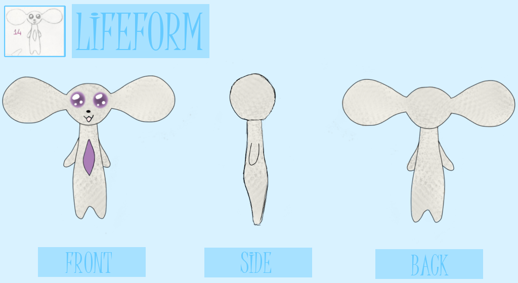
Lifeform Turnaround

Finally completed my lifeform turnaround just in time! I decided to use number 14 for this turnaround.


Not too sure how I feel about this one, it looks kind of cute yet its eyes give off a really creepy vibe. I also attempted to make it look like it's furry but I could quite get it right. I think looking at tutorials online and practising more textures is a step I need to take!
Share:

Sunday, 14 September 2014

Machine and Structure Turnarounds


With the start of the course closeby I wanted to get my turnarounds finished before we started. 


For my machine turnaround I chose to do number 27. I thought the design was pretty cute and also interesting. I think this turnaround went pretty well though the shading could be improved, I was a little unsure how to give the robot the metallic feel though I think I somewhat show that. I also think the side looks a little flat, it kind of reminds me of a sonic screwdriver. 
 
LEFT: Original shading, RIGHT: Shading without the pattern. 


For my structure turnaround I decided to do number 51. I liked it because it was an interesting shape. I had a few problems trying to colour this. I wanted to give the impression that the outside was grassy. On the left above the image was the first shading I did for the the turnaround. I disliked the texture I had created. I then started again and on the right above the image you can see the shading that was underneath my second attempt.  I then draw on small blades of grass over the top. It's almost to the texture I desired but not quite, I think taking the time to practice how to paint different textures would definitely be useful to me.

I'll post my lifeform as soon as it's completed though I'm also struggling with that a little so far.
  

Share:

Thursday, 11 September 2014

Wednesday, 3 September 2014

CAA Summer Challenge Thumbnail Sketches 22-31

Sorry I haven't posted lately but I've been feeling unwell. With our first day approaching rather rapidly I'm not sure I'll get all 101 done, lets hope that's not the case though! I decided to do my next lot digitally and see if I found that any easier. 


I liked working this way but I'm still drawing too large hence it's taking me a lot longer than it should to complete these. I probably took too long fussing over the basic shading when they looked fine without it! 

I quite like 27, 28, 29 and 30. I'd definitely consider 27 for the machine turnaround.  

Though I've focused on more machines and structures here like I said I would I'm still struggling with structures. I think I'll focus on making some really interesting structures next so I have lots of ideas to choose from when I start my turnarounds.


Share: