Showing posts with label Space Oddities. Show all posts

Thursday, 11 December 2014

Stanley Kubrick's The Shining (1980)

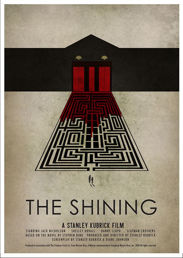
Figure 1. The Shining Poster 

The Shining is a thriller of a film in which Jack slowly descends into madness. Jack looks after the overlook hotel with his family however with little contact with anyone other than his family Jack starts to see things that aren’t actually there which convince him to kill his family.

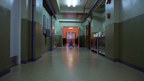
The set plays well into the film first seeming like a huge place to explore and look through it seems innocent enough later on, when Jack is going crazy, It becomes a place of nightmares which is hard to navigate and escape from. “Instead of the cramped darkness and panicky quick editing of the standard-issue scary movie, Kubrick gives us the eerie, colossal, brilliantly lit spaces of the Overlook Hotel” (Bradshaw. 2012). By making the hotel seem innocent at first it makes the audience tense as to when the real horror actually starts.

Figure 2. The Overlook 

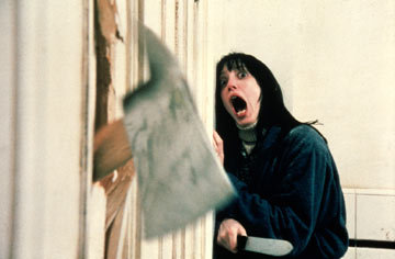
Some places in the hotel are also scarier than others.  We’re made to feel tense about room 237 in particular, paired with steady cam and a film that leaves out normal horror conventions this has Kubrick’s name plastered all over it. Larson mentions in his review “Why is Room 237 the only room the movie enters? Because it’s the only one we fear. Just about everything that’s scary about The Shining depends on where we are.” (Larson, S.D). It’s this tension that makes the film uneasy to watch, it’s an excellent way of doing horror.

Figure 3. Chopping down the door 

In the film however it is clear that there’s already something off about Jack and his relationship. As Clark notices “Kubrick presents a despairing view of American married life, where the lack of love and intimacy is accentuated by the claustrophobic surroundings.” (Clark, 2012). This could show that Jack could have been somewhat crazy from the start but the Overlook helped bring this madness out.

The Shining is an unconventional horror which uses a different kind of set to leave you on the edge of your seat.

Bibliography
Bradshaw, P (2012) http://www.theguardian.com/film/2012/nov/01/the-shining-review (accessed on 11/12/14)
Larson, J (S.D) http://www.larsenonfilm.com/the-shining (accessed on 11/12/14)

Illustration list
Kubrick, S (1980) Figure 1. The Shining Poster https://m1.behance.net/rendition/modules/63162429/disp/582ccc71a712ad247c535b89bba14410.jpg   (accessed on 11/12/14)
Kubrick, S (1980) Figure 2. The Overlook https://c1.staticflickr.com/3/2261/2172893762_af0c07b8e6.jpg (accessed on 11/12/14)

Kubrick, S (1980) Figure 3. Chopping down the door http://www.hwdyk.com/q/quizimage/shining.jpg (accessed on 11/12/14)
Share:

Roman Polanski's Repulsion (1965)

Figure 1. Repulsion poster 

Repulsion is a film about Carol, a women who is clearly not well. The film takes us inside her mind and shows us her repulsion towards men and her sexual anxiety. Kendrick describes this film as “an intensely experiential film, bringing literal physicality to mental and emotional fissures.” (Kendrick, s.d). There aren’t many films like it so it can be indeed called experimental.

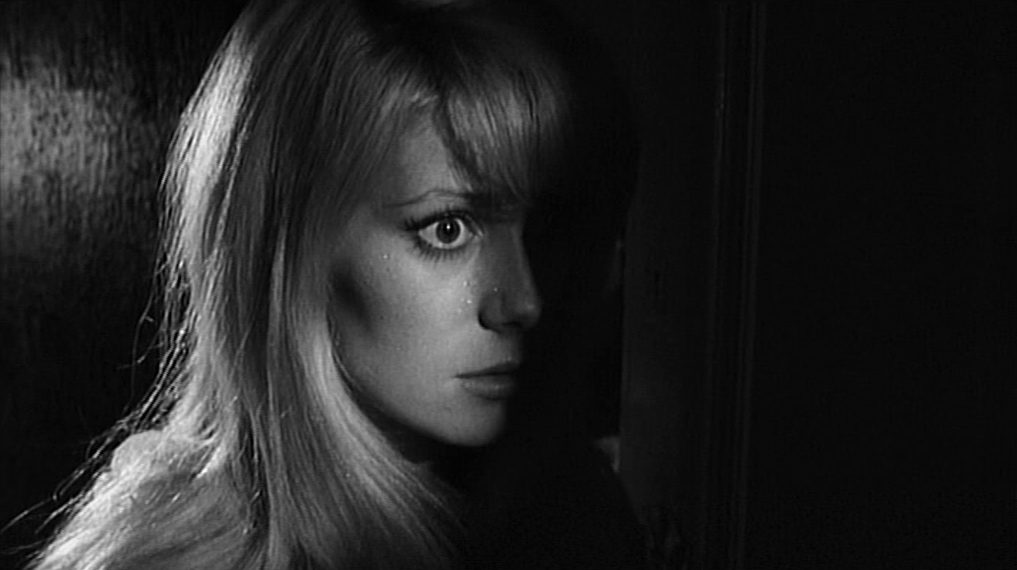
Figure 2. Closeup

Set in the Sixties this film is clearly challenging the notion of the sixties being a period in which people were sexually active. Canavese states in his article “Polanski mocks the sunny archetype of the free-spirited girl of the swingin' sixties by proffering a microscopic and intensely scary look at humanity gone wrong” (Canavese, s.d). This could possibly show that many sexual advances at the time were not always wanted, and could also show that those not joining in with society are seen as strange.

This film helps us feel the tension Carol is feeling by putting the camera close to her face so we can see her emotions. There is also symobilism in the film such as the rotten carcass which could symbolise the rotting of her brain.

 Figure 3. Wall of hands

The set is a big part of showing Carol’s anxiety.  Nashawaty mentions this in his review “Left alone for a week, she slowly 
 unravels—haunted by strange noises, hallucinations, and walls of grasping hands pawing at her” (Nashawaty, 2009). As her anxiety gets worse the apartment does too. Cracks begin to show in the walls and the apartment becomes skewed and neverending. Towards the end of the film one of the corridors becomes infested with hands. This clearly shows us Carols fear of intimacy.

Repulsion is a great way of showing how someone with a mental illness may be feeling, it is truly using it’s set to its full effect.

Bibliography
Canavese, P (S.D) http://www.grouchoreviews.com/reviews/3489 (accessed on 10/11/12)
Kendrick, J (S.d) http://www.qnetwork.com/index.php?page=review&id=2252 (accessed on 10/11/12)
Nashawaty, C (2009) http://www.ew.com/ew/article/0,,20293064,00.html  (accessed on 10/11/12)

Illustration List
Polanski, R (1965) Figure 1. Repulsion poster https://www.movieposter.com/posters/archive/main/61/MPW-30800 (accessed on 10/11/12)
Polanski, R (1965) Figure 2. Closeup http://filmgrab.files.wordpress.com/2014/07/4934.jpg?w=1017 (accessed on 10/11/12)

Polanski, R (1965) Figure 3. Wall of hands http://projectdeadpost.com/wp-content/uploads/2013/07/Repulsion-2.jpg (accessed on 10/11/12)
Share:

Dario Argento's Suspiria (1977)

Figure 1. Suspiria Poster

Suspiria is a highly stylised film. Set in a ballet school, lots of strange things begin to happen. These strange things include perfectly made murders of some of the schools students.
Figure 2. Death Still

These murders within the film are shown in a stylised way as opposed to a realistic way. This makes the murders much more memorable. Brayton describes the film as “artistic in its violence, even by the standards of Italian genre filmmaking in the 1970.” (Brayton, 2012).
Figure 3. Lighting Still

The set only adds to the strangeness with the colours of the sets being extremely pushed. As Smith says about the film “there's Argento's masterful use of deep primary colours — the sets are bathed in garish red and green light (he acquired 1950s Technicolor stock to get the effect) giving the whole film a hallucinatory intensity.” (Smith, 2010). The film indeed is somewhat hallucinatory with the bright colours playing into the weird goings on within the film. It’s an interesting way to use colour, especially in such a dark film.
Figure 4. Set Still

The set of Suspiria is an elegant one, which is obviously odd for a horror film. Kermode interestingly says that “This is horror shot with dazzling energy yet with the visual depth and acuity of a Renaissance painting.” (Kermode, 2008). Comparing this film to a renaissance painting shows just how visually breath-taking this film is. As you can see in figure 4 the set is gorgeous and highly detailed and completely fits with the characters in this scene.

Suspiria is an excellent way of showing how using stylised methods can make a visually pleasing film.

Bibliography
(Accessed on 10/12/14)

Illustration List
Argento, D (1977) Figure 1. Suspiria Poster http://wrongsideoftheart.com/wp-content/gallery/posters-s/suspiria_poster_08.jpg (Accessed on 10/12/14)

Argento, D (1977) Figure 4. Set Still http://deeperintomovies.net/journal/image09/suspiria5.jpg (Accessed on 10/12/14)
Share:

Tuesday, 9 December 2014

Nicolas Winding Refn's Only God Forgives (2013)

Figure 1. Only God Forgives poster 

Only God Forgives is a film in which Julian (Ryan Gosling) and his extremely domineering mother Crystal seek revenge for his brothers’ death. Extremely violent and grotesque Only God Forgives shows a cycle of revenge in the grimmest way possible.  

Figure 2. Julian looks at his hands

Julien is shown to be struggling with his masculinity within the film. As Sexton mentions in his review “Only God Forgives subverts all our expectations, making him the opposite of what audiences want him to be as an action hero (not only does he not get his shirt off, by the way, he dons a formal three-piece suit halfway through the film and then gets so battered he looks grotesque).” (Sexton, 2013). What Sexton is saying is true, the portrayal of Julian by Gosling is very different to his previous characters who are often very manly. This makes a very interesting casting choice. Julian is perceived as weak and not masculine enough for his mother, his mother stating that he was jealous of his older brother. She tells him how his brother was more of a man and often questions his choices this obviously undermines his masculinity.


Figure 3. Open Hands & Figure 4. Clenched Hands 

Hands are also very present in this film. Harkness speaks about hands saying that “Idle hands are the devil’s tools, the film seems to be saying, and in this neon-lit circle of hell such direct and uncompromising action is a symbol of the moral absolutism required to counter the craziness.” (Harkness, 2013). The hands in the film are often a symbol of morality and early in the film someone has their hand chopped off in relation to their morality. Julian also keeps looking at his hands during the film as shown in figure 2. As he looks at them he often clenches them like in figure 4. During the film his seems unable to touch women and this clenching of his hands into fists shows this repression.
 
Figure 5. Lighting on Crystal

What really stands out in this film is the lighting and the colours of the set. Sélavy mentions this in his article “With its rich colours and intricate patterns, its sensual, oppressive light and oblique storytelling, and at its centre, a laconic, supernaturally powerful, sword-wielding protagonist, Only God Forgives feels like a very Asian movie” (Sélavy, s.d). The colours of the film are indeed oriental, using reds and yellows which are often associated with Asia but these colours also connote meanings of danger and warning. Red is used very often and could also connote blood in this very violent film. As seen in figure 5 the lighting can also be very dark but the colour shines through in some areas.

Only God Forgives is a hard film to follow with its show rather than tell nature, it is however visually exciting and this nature provokes the thought of the audience.

Bibliography

Illustration List
Refn, N (2013) Figure 1. Only God Forgives poster http://upload.wikimedia.org/wikipedia/en/c/ce/Only_God_Forgives_poster.jpg (Accessed on 9/12/14)
Refn, N (2013) Figure 2. Julian looks at his hands http://www.highlycontrasting.com/wp-content/uploads/2013/08/only-god-forgives07.jpg  (Accessed on 9/12/14)

Share:

Tim Burton's Edward Scissorhands (1990)

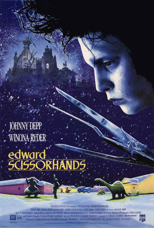
Figure 1. Edward Scissorhands Poster

It’s no doubt that Edward Scissorhands is a popular film but as Biodrowski says in his review “Edward Scissorhands really does work as a complete film, mixing a fairy tale sensibility with a satiric view of life in the suburbs and crystallizing for the first time the essential themes underlying Burton’s work.” (Biodrowski, 2000). This film shows Edward, a boy with scissorhands, struggling to deal with the strange suburbs. He’s faced with the idea of conformity and trying to fit in even though he is strange.
Figure 2. Hug still

It’s no doubt that this film is a poke at society. Larson describes the film as “the cinema’s most enchanting parable about the misunderstood and alienated artist.” (Larson, Unknown). Edward is this stranger in the suburbs and at first he struggles to fit in until his neighbours start to appreciate his artistic skills. It’s only then that his strangeness is accepted because he becomes useful and part of their conformity. This is shown when Edward cuts their hedges for them, even though they all ask for different types of hedges to be cut they still all have to have one just like their neighbours. There is this underlying element of beauty in the strange and some love Edward just as he is, this is shown in the relationship between Edward and Kim. As shown in figure 2 Kim asks Edward to hug her, accepting his strangeness and showing that she loves him for who he is.

 Figure 3. Street Still 

A key strength of this film is the production design. Maslin mentions in his review that “the production design is the central good idea, perhaps even the sole one.” (Maslin, 1990). In the film the bright colourful houses in the suburbs juxtapose the gloomy castle in which Edward is found in. It’s odd however that the castle seems almost safe and comforting in comparison to the suburbs. It’s the suburbs instead that seem odd and uncomfortable with its idea of conformity.

Edward Scissorhands has a good story with lots of hidden ideas and meanings, it’s production design is strong and aides well to the story.

Illustration List
Burton, T (1990) Figure 1. Edward Scissorhands Poster http://images.moviepostershop.com/edward-scissorhands-movie-poster-1990-1020280845.jpg (Accessed on 9/12/14)
Burton, T (1990) Figure 2. Hug still http://llnw.wbez.org/main-images/Edward-Scissorhands-movie-still.jpg (Accessed on 9/12/14)
Burton, T (1990) Figure 3. Street Still http://fogsmoviereviews.files.wordpress.com/2012/05/edward_scissorhands_hill.png (Accessed on 9/12/14)

Bibliography
Larson, J (unknown) http://www.larsenonfilm.com/edward-scissorhands (Accessed on 9/12/14)

Share:

Jean Cocteau's La Belle et la Bête (1946)

 Figure 1. La Belle et la Bête Poster

 La Belle et la Bête is a fantastical retelling of the popular fairytale ‘Beauty and the Beast’. As Crowther states in his review it’s “telling a familiar fairy-tale with pure imagery and enchantment through the sensuous devices of the screen” (Crowther, unknown). Aided well by it’s design it certainly seems magical and much like a fairytale.

Figure 2. Dining Hall Still

What’s magical about La Belle et la Bête is the way the special effects are done as Harley says “The simple and surreal effects bind the spell: by using the tangible magic of hands through walls, moving statues, steamy paws and the rest, Cocteau makes rapt believers of us all – adults and children alike.” (Harley, 2013). Though this is not realistic the effects instead look dreamlike and fit in well with the fairytale setting of the film. This films effects instead appeal to the children within us rather than the realistic thoughts of an adult. 

Figure 3. Castle Still

The film also has a very elegant set design especially within the beasts’ castle. In his article Caldwell mentions that “the gorgeous production design and magical special effects go a long way in making it palatable” (Caldwell, 2011). The production design in the film has been deeply considered, with small elements making the elegance and beauty shine through. For example as shown in Figure 3 the soft net curtains that drape as Belle explores the castle add to the overall look of glamour in the castle. There are also the objects in her room which add to the grandness of this fairytale remake.

La Belle et la Bête is an inspiration to production designers and an example of making your props and set feel as if it is part of the same world.

Illustration List
Cocteau , J  (1946) Figure 2. Dining Hall Still http://image.toutlecine.com/photos/b/e/l/belle-et-la-bete-1946-28-g.jpg (Accessed on 4/11/14)
Cocteau , J  (1946) Figure 3. Castle Still http://thepandorian.com/wp-content/uploads/2009/08/pdvd_022.jpg (Accessed on 4/11/14)

Bibliography
Harley, K (2013) http://www.totalfilm.com/reviews/cinema/la-belle-et-la-bete (Accessed on 4/11/14)


Share:

Michael Powell & Emeric Pressburger's Black Narcissus (1947)

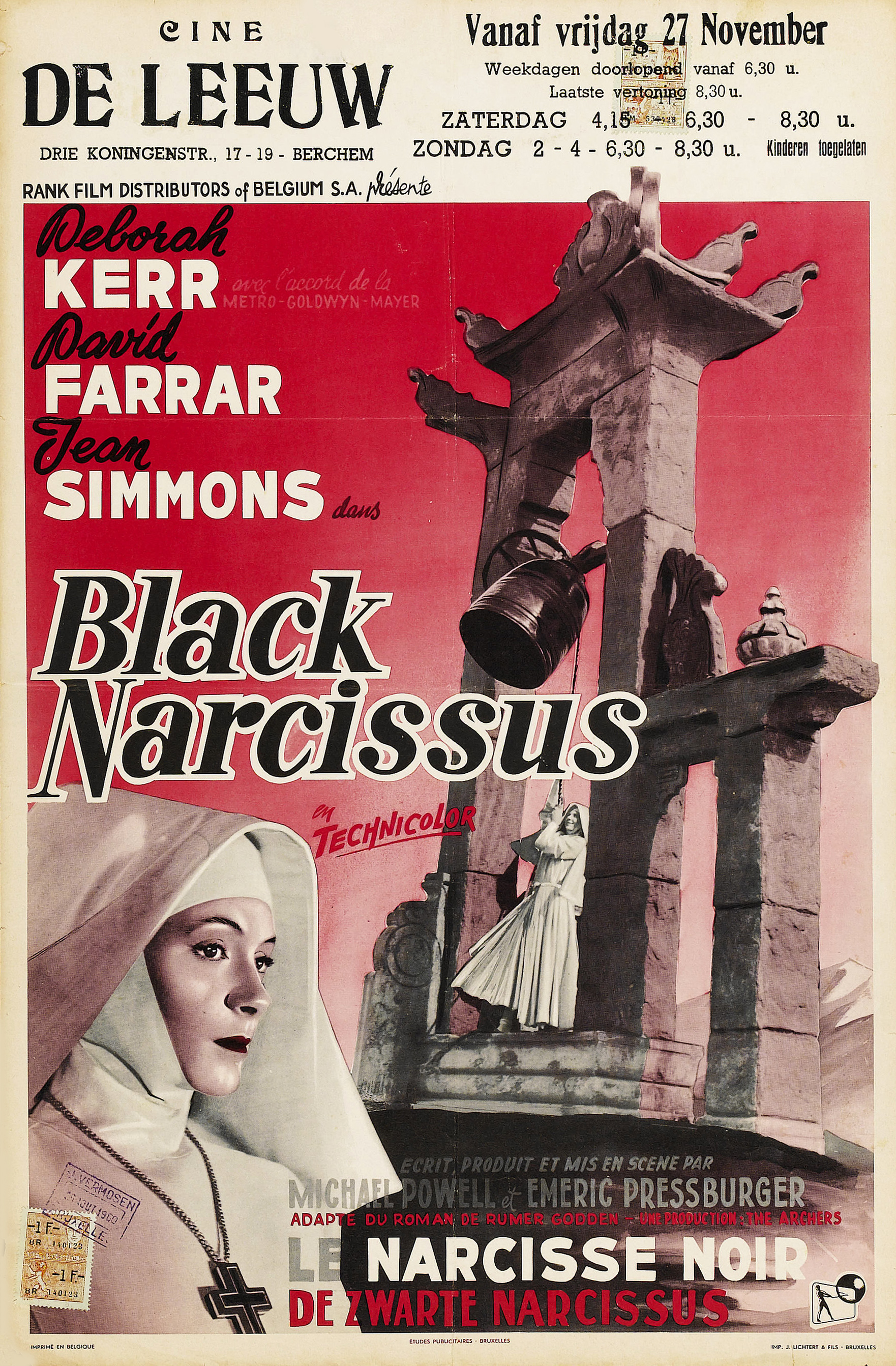
Figure 1. Black Narcissus poster 

Made in 1947 Black Narcissus is a truly unique film. Dealing with themes such as tension and isolation the story focuses on nuns making a former brothel in the Himalayas into a nunnery as well as a school and hospital. The nuns become lonely and sexually frustrated in this new place.

This rather than being portrayed by the actors is instead portrayed by the environment. In his review Uhlich describes the set, “those matte-painting vanishing perspectives and cinematographer Jack Cardiff’s harshly exaggerated lighting cues—creates a psychologically charged space in which an ungodly tragedy can unfold” (Uhlich, 2012). The film was all made in a studio with Matte Paintings and this artificiality makes the environment seem strange which only adds to the film. The matte paintings used in the film are incredibly detailed and give the impression of a real place.

 Figure 2. Set with Matte Painting

The set is also great at showing the hysteria of sister Ruth. As mentioned by Brussat “Michael Powell has called it an erotic film, and so it is on many different levels. There is the sexual arousal of Sister Ruth who casts aside her habit and puts on a red dress and thick red lipstick” (Brussat, s.d). When she changes her clothes and appearance the lighting also changes. The colours change from blue to read to show her new attitude and her newfound sexual desire.

 Figure 3. Sister Ruth applies her lipstick

The memories and flashbacks in the film also help us to understand the nuns desires. Kendrick recognises this in his review “Yet, as the film makes clear, walls have memories. In fact, memory is one of the most striking themes throughout Black Narcissus, as it becomes the avenue through which ideals are shattered and dreams disillusioned.”(Kendrick, s.d). These flashbacks as mentioned in the quote add to the sorry feeling we get for the nuns. There are also other visual references to how the nuns feel. For example the birdcages show how they feel unfree and the flowers show their innocence. Also their white clothes become dirty towards the end however as they leave the rain falls which could be symbolism for them being cleansed.

Though this film isn't always clear it is indeed thought provoking and uses it’s set to advance it’s story.

Illustration List

Powell, M/Pressburger, E (1947) Figure 1. Black Narcissus poster http://www.doctormacro.com/Images/Posters/B/Poster%20-%20Black%20Narcissus_10.jpg (Accessed on 9/12/14)
Powell, M/Pressburger, E (1947) Figure 2. Set with Matte Painting http://mmimageslarge.moviemail-online.co.uk/Black-Narcissus-5711_1.jpg (Accessed on 9/12/14)
Powell, M/Pressburger, E (1947) Figure 3. Sister Ruth applies her lipstick http://image.glamourdaze.com/2012/09/1940s-lipstick-Kathleen-Byron-in-Black-NarcissusC.jpg (Accessed on 9/12/14)

Bibliography
Brussat, F/M (s.d) http://www.spiritualityandpractice.com/films/films.php?id=20119 (Accessed on 9/12/14)
Kendrick, J (s.d) http://www.qnetwork.com/index.php?page=review&id=2412 (Accessed on 9/12/14)

Uhlich, K (2012) http://www.timeout.com/us/film/black-narcissus-3 (Accessed on 9/12/14)
Share:

Thursday, 23 October 2014

Ridley Scott's Alien (1979)

 Figure 1. Alien Poster

Alien is a feast for the eyes yet it’s less known for its story. As Malcom states “The basics of the plot are simple. Seven astronauts, working on a battered space tug that is apparently commercially owned, touch down on another planet, find something odd for the boffins back home, bring it back into the ship and are faced with an ever-growing monster.” (Malcom, 2009). But Alien’s basic plot set a great foundation for appreciating the other fantastic things about the film.

Figure 2. Spaceship Set

The most impressive thing about Alien is its highly detailed set.  Jones mentions in his review the film has “imaginative bio-mechanical production design (with the alien created by Swiss artist HR Giger)” (Jones, unknown).  The spaceship itself is built of many layers decorated with pipes and switches and gives you an impression of a gritty, working spaceship. There’s also the sets that belong to the alien planet. These sets give the impression of being vast and unexplored. Both sets are amazing in terms of design with every little detail thought out, it’s clear that a sense of realism was trying to be achieved.

Figure 3. Extreme Close up 

The way the camera is used in Alien is interesting. The shots help create a tense atmosphere and put you on the edge of your seat. At the start of the film the camera is steady while the crew do mundane things such as eat breakfast together but later on the camera is in first person or there will be an extreme close up of a characters face. An extreme close up (like in fig.3) shows the emotions close up and immediately involves the audience. Ridley Scotts choice to get the audience feel involved is what can make this film so terrifying.

In Alien it’s not made clear until towards the end who our protagonist will be, everyone is shown as an equal until they’re killed off. It’s interesting how Ripley (Sigourney Weaver) becomes the protagonist towards the end as often in sci-fi movies a woman is portrayed as a side character. Larson mentions Sigourney Weaver in his review saying “There is Sigourney Weaver, not throwing her womanhood around but rather carrying herself as if a strong female figure in this time and place was simply a matter of fact.” (Larson, unknown). Her portrayal of Ripley is rather impressive, she’s clearly a smart woman and though she shows signs of fear she’s still a strong character which makes her highly interesting to an audience.

Though Alien isn’t a perfect movie, it’s a movie that will engage many for different reasons.

Illustration List

Ridley Scott (1979) Figure 1. Alien Poster http://c4941054.r54.cf2.rackcdn.com/10418.jpg (accessed 23/10/14)
Ridley Scott (1979) Figure 3. Extreme Close up http://www.deepfocusreview.com/reviews/images/alien.3.jpg (accessed 23/10/14)

Bibliography
Jones, A (unknown) http://www.radiotimes.com/film/zwts/alien (accessed 23/10/14)
Larson, J (unknown) http://www.larsenonfilm.com/alien (accessed 23/10/14)

Share:

Stanley Kubrick's 2001: A Space Odyssey (1968)


Figure 1. 2001: A Space Odyssey Poster 

2001: A Space Odyssey as a whole is more of an idea than a story. Its scenes are made for purpose and to portray ideas. As Humanick says in his article “At its core, the film is a journey, a summarization of those questions that are both the simplest in their inquisition and most profound in their answers: Who are we, where do we come from, and where are we going?” (Humanick, 2007). One question to keep in mind is what exactly is Kubrick trying to say about technology? At first he shows technology to be amazing and fantastical however later on it is flawed and dangerous. It’s interesting what Rob Gonslaves says in his review “Technology may have enabled long-distance communication, but hasn't improved its human quality at all.” (Gonslaves, 2008). Maybe what Kubrick is trying to say is that humans can possibly achieve great things however they’re still flawed.


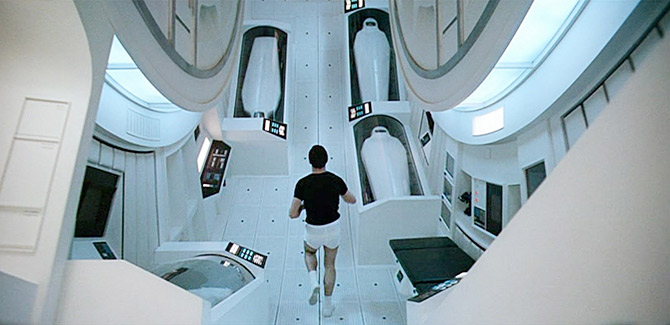
 Figure 2. Ship interior

Whats interesting about 2001: A Space Odyssey in particular is the use of set to show the advancement of technology. Though thought has been put into the story more so has been put into the design. As Milne says “What matters for the lay spectator is that Kubrick's vision of space is as endlessly fascinating as a vast toyshop of intricate, superbly photogenic working models.” (Milne, 2010). The spaceship interiors are full of buttons to press and lots of gadgets made for a purpose.


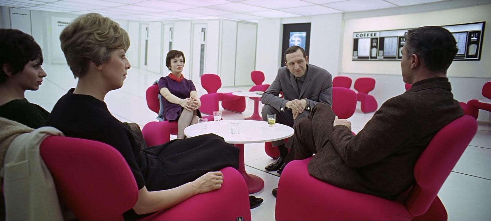
Figure 3. Distance shot

Kubrick shows his sets through the use of panoramic and mid distance shots alienating his audience and forcing them to wait and watch rather than involving them. You feel like a spectator and that’s what makes 2001: A space Odyssey a thought provoking film.


Illustration list
Kubrick, S (1968) Figure 2. Ship interior http://i.dawn.com/2012/10/jogging-2001-space-odyssey-screenshot-670.jpg (Accessed on the 21/10/14) 
 Kubrick, S (1968) Figure 3. Distance shot


Bibliography
Gonslaves, R (2008) http://www.efilmcritic.com/review.php?movie=1914&reviewer=416 (Accessed on the 21/10/14) 
Humanick, R (2007) http://www.slantmagazine.com/film/review/2001-a-space-odyssey (Accessed on the 21/10/14) 

Share:

Wednesday, 15 October 2014

Merian C. Cooper and Ernest B. Schoedsack's King Kong (1933)


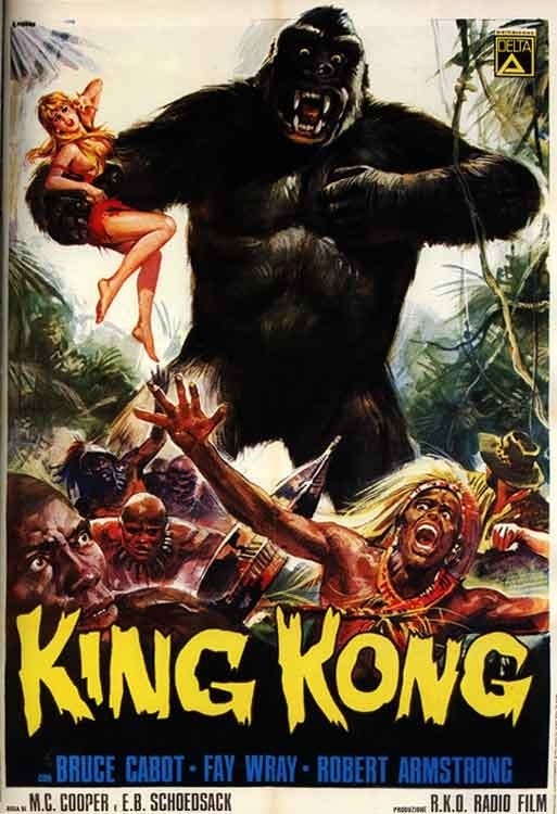
Fig1. King Kong Poster

King Kong is a movie of action, set on an island of prehistoric monsters including a huge ape named Kong. Carl Denham, a filmmaker wants to film the island and hopes to find something spectacular and film it. He takes a young girl named Ann with him to be the lead in his film however when they get onto the island the natives ask for her to be the sacrifice for Kong. They refuse and leave but the natives kidnap Ann and Kong takes her further into the island.

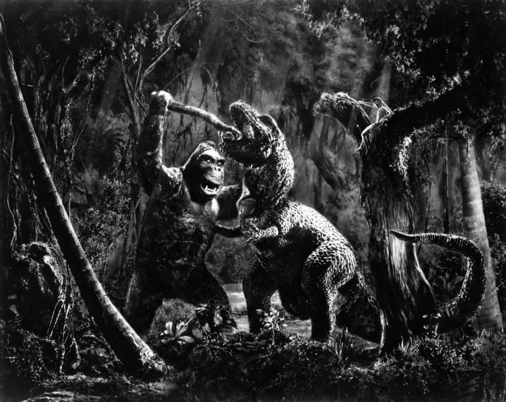
Fig 2. Jungle Set
The sets of the island are particularly impressive. Each set is realistic and particularly in the forest scenes the illusion of a deep forest is given. A realistic set is pretty important to this film because they were creating creatures that weren’t real but because of its realistic sets the audience can relate better to the film.

Fig 3. Kong Fighting
King Kong is notable for the way Kong is made and J, Anderson says that “Technicians made the giant ape from a combination of oversize body parts, small models and stop-motion animation.” (Anderson, J). At the time this technique of making Kong would have astounded the audience and they certainly would have been thrilled by the fighting scenes which were probably thought to have been impossible before. Though as E, Levy notes in his review “By today’s standards, the film’s special effects look primitive, but “King Kong” was the first film to pioneer the basic machinery and techniques that modern filmmakers, such as Spielberg and Jackson, later refined with the help of electronics and computers.” (Levy, 2011). It’s important to note that without the special effects in King Kong many modern films we love today wouldn't have been made.

Fig 4. Ann and the Natives

Though King Kong is celebrated for its use of set and special effects it is often criticised for its portrayal of the natives and the character Ann. Smith states in his review that “Beyond its pure escapist value, Kong has been interpreted as a symbol for persecuted blacks and seen as a metaphor for man's destruction of the environment, natural order and other things.” (Smith, 1991). One interpretation is that Kong is a metaphor for the slaves that were taken to America, on the island he is a king and is free however in America he is treated badly and is there to be a slave for their entertainment. The natives are also presented in a racist way showing them to be uncivilised and of lesser people, there culture is in no way respected by the crew. Ann, the only lady of the crew, is also disrespected. Jack who clearly finds her attractive treats her badly saying that she has no place among them. Later Jack tells her that he loves her and they kiss- it clearly shows the primitive thinking of men being able to do what they like to a woman and for them to still get the girl like she’s some sort of prize. This film shows Ann to be helpless and she has to be saved every time, this sexist portrayal will surely have you rolling your eyes.

However though this film is quite clearly sexist and racist I don’t think it should be forgotten about, it’s important to remember that this is how people thought back in the 1930’s and denying yourself of acknowledging it’s existence is also like denying that we didn't have these problems in society at all.

Illustration List 

Cooper, M/ Schoedsack, E (1933) Figure 4 Ann and the Natives http://www.movpins.com/big/MV5BMjIzMDcyNTEzMl5BMl5BanBnXkFtZTcwNTQ4OTUwNA/still-of-fay-wray-in-king-kong-(1933).jpg (Accessed on the 12/10/14)

Bibliography

Anderson, J (2005) http://www.combustiblecelluloid.com/classic/kingkong.shtml (Accessed on the 12/10/14)
Smith, M (1991) http://articles.latimes.com/1991-10-24/news/ol-253_1_king-kong (Accessed on the 12/10/14)


Share:

Tuesday, 30 September 2014

Fritz Lang's 'Metropolis' (1927)

Fig 1. Metropolis Poster

Set in a vast futuristic city Metropolis is a classic film which shows many sci-fi elements we see in films today. As Ed Halter notes in his review “Lang's impossibly vast skyscraper-ziggurats (inspired, it's said, by his first view of the Manhattan skyline) are the blueprint for nearly every science-fiction movie city of the past 30 years” (Halter, 2007). However underneath the beautiful city that is Metropolis is another city in which workers operate machines in order to give power to the city above. The people who live above the surface don’t know much about the people below and that includes the son of the city's mastermind, Freder. When Freder is in the city's garden he comes across Maria a girl from the workers city below. He follows Maria into the workers city and becomes interested in the workers there. 

 Fig 2. Metropolis buildings
Fig 3. Metropolis street

The sets and special effects, though outdated, don’t let the film down and has clearly led the way for films that have followed it. As Matt Prigge says in his article “Metropolis has always felt and looked visionary, with its pioneering effects and prophetic, influential urban design” (Prigge, 2010). The city of Metropolis looks like it has an art deco influence, it’s geometrically pleasing and gives the impression of extravagance. As you can see from the two stills above every detail has been considered, from the moving cars to the background buildings. 

Fig 4. Workers City

Interestingly the workers city, though it follows the a similar style, is plainer in comparison. It’s somewhat grungy and dim and shows that the people below are not living in as great condition as the people above. The film deals with Marxist and political issues, clearly showing the divide between the working class and the upper class. When the film was made Germany was struggling after it’s loss of world war one and many Germans were poor and working class citizens and this could well be a contributor as to why the film was made. Roger Ebert commented on the workers in the film saying that “What they're doing makes no logical sense, but visually the connection is obvious: They are controlled like hands on a clock.”  (Ebert, 1998). 

Metropolis marks a milestone in film history being a film already ahead of it’s time. 


Illustration list 

Lang, F. (1927) Figure 1. Metropolis poster http://upload.wikimedia.org/wikipedia/en/9/94/Metropolis_poster.jpeg (Accessed on 30/09/14)

Lang, F. (1927) Figure 2. Metropolis buildings http://spfilmjournal.files.wordpress.com/2013/06/screen-shot-2013-06-24-at-am-12-42-37.png (Accessed on the 30/09/14)

Lang, F (1927) Figure 3. Metropolis street http://spfilmjournal.files.wordpress.com/2013/06/screen-shot-2013-06-24-at-am-12-42-33.png (Accessed on the 30/09/14)

Lang, F (1927) Figure 4. Workers city https://blogger.googleusercontent.com/img/b/R29vZ2xl/AVvXsEibhX9XJLiS_tWCPcV50IED96vZoNs6IDzAdbXNFWSjGNknktFJUdovtccjrU9Vq983vaYRkW0DhyphenhyphenX1jAfNKGlcpfMnGQzTtff0sv6uYB3eu_1AAB8fv9U3SbLL1OJTYDY3i1n3nDOmrmWQ/s1600/10_metropolis_workers.jpg (Accessed on the 30/09/14)

Bibliography

Ebert, R. (1998) http://www.rogerebert.com/reviews/great-movie-metropolis-1927 (Accessed on the 30/09/14)

Halter, E (2007) http://www.villagevoice.com/2007-07-10/film/back-to-the-future/ (Accessed on the 30/09/14)

Prigge, M. (2010) http://www.philadelphiaweekly.com/screen/capsules/Metropolis.html (Accessed on the 30/09/14)
Share:

Tuesday, 23 September 2014

Robert Wiene's 'The Cabinet of Dr. Caligari' (1920)

Fig 1. The Cabinet of Dr. Caligari Poster

The Cabinet of Dr Caligari is abstract. The plot is somewhat disorientating; the ending itself raising a few questions. “The Cabinet of Dr Calgari is one of silent cinema’s most sacred objects, credited with being one of the first horror films with one of the first twist endings.” (Kaufman, 2014). The film is set in the German town of Holstenwall where Dr Caligari displays a Somnambulist; he claims that the man, named Cesare, has been sleeping for 23 years. When awakened Cesare tells Francis’s friend Alan that he will be dead by dawn and surely enough Alan is found dead the next morning. 

 
Fig 2. Street Still

As the plot unfolds you can tell something is not right and the set supports this idea. 
“The actors inhabit a jagged landscape of sharp angles and tilted walls and windows, staircases climbing crazy diagonals, trees with spiky leaves, grass that looks like knives.” (Ebert, 2009). The set is dark and gives the impression of a painting or drawing. It’s very stylised and the buildings are uneven and crooked coming in many different shapes. We know by looking at the set that it’s not real but this is no coincidence. It’s exaggerated shapes and textures give the audience the impression that they’re seeing the film through the eyes of a mad man and is very similar to how some theatre shows like to remind their audience that the show is not real. “The sets are precarious zigzagging structures that seem ready to topple on the protagonists” (Bleasdale, 2014). An interesting set is shown in the still above. The buildings are warped and bend inwards to where the characters are standing, this is an example of good composition because it draws the eyes to the centre. This was most likely considered when it was being designed. 

 
Fig 3. Rooftop Still

A particular scene of interest is the scene in which Cesare kidnaps Jane. Cesare carries her to the rooftop, a stereotypical trope we see in films today. Jane is also wearing white at the time of her kidnapping which symbolises innocence and it contrasts nicely with the dark set. The set is also interesting in this scene the rooftop again like in earlier sets curves inwards and draws your eye to where the characters are but it’s also simplistic and gives a basic impression of a rooftop. 

The Cabinet of Dr Caligari proves that you don’t need a big budget to make a good film and that different isn't always a bad thing. 


Illustration List

Wiene, R. (1920) Figure 1. Caligari Poster. http://cdn8.openculture.com/wp-content/uploads/2013/10/Cabinet-Of-Dr.-Caligari-.jpg (Accessed on 23/09/14)

Wiene, R (1920) Figure 2. Street Still. http://mayostreetarts.org/wp-content/uploads/2014/07/1-cabinet-of-dr-caligari-granger.jpg (Accessed on 23/09/14)

Wiene, R (1920) Figure 3. Rooftop Still. http://www.leninimports.com/cabinet_of_dr_caligari_poster_shop_new_2.jpg  (Accessed on the 23/09/14)

Bibliography 

Bleasdale, J (2014) http://www.electricsheepmagazine.co.uk/reviews/2014/08/01/the-cabinet-of-dr-caligari/ (Acessed on the 23/09/14)

Ebert, R (2009) http://www.rogerebert.com/reviews/great-movie-the-cabinet-of-dr-caligari-1920 (Accessed on 23/09/14)

Kaufman, S (2014) http://www.littlewhitelies.co.uk/theatrical-reviews/the-cabinet-of-dr-caligari-27635 (Accessed on 23/0914)


Share: