1) Intro to Autodesk Maya:
a ) Modelling (NURBS and Polygon)
b ) Character Part 1: Modelling
c ) Common Shaders
d ) UV Maps
e ) Character Part2: Texturing and Shaders
f ) Lights and Shadows
g ) Character Part3: Lighting and Rendering
2) Modelling 1: Digital Sets
a) Modelling
b) UV Layout and Texturing Preparation
c) Lighting
d) Colour Maps
e) Bump and Specular Maps
f) Dirt Maps and Final Render
3) Lighting and Rendering1: Intro to Lighting
a) Exterior Lighting: Midday
b) Exterior Lighting: Sunset
c) Exterior Lighting: Romantic
d) Exterior Lighting: Night
4) Visual FX: Visual Effects 2
a) Render Layers: Software
b) Depth of Field
Thursday, 18 December 2014
Friday, 12 December 2014
Thursday, 11 December 2014
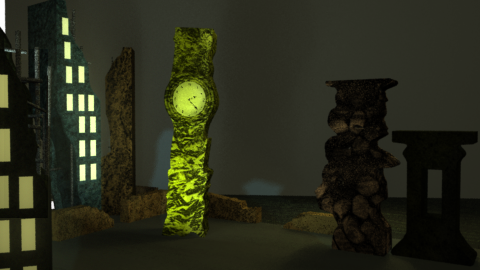
WIM: Scene so far
Currently Maya is being extremely spiteful and not letting me render in mental ray which means my matte painting isn't showing up. This is what I've got so far, if it comes to the worst I'll have to take my render into photoshop and then import in the Matte Painting.
I really hope mental ray works because I hate the quality of this image! I've honestly tried everything I could think of. I've tried turning mental ray on and off again, deleted all my shaders, deleted all the history on my models, reloaded Maya countless times, I'm extremely livid right now and I really can't think what else to do!
Stanley Kubrick's The Shining (1980)
Figure 1. The Shining Poster
The Shining is a thriller of a film in which Jack slowly descends
into madness. Jack looks after the overlook hotel with his family however with
little contact with anyone other than his family Jack starts to see things that
aren’t actually there which convince him to kill his family.
The set plays well into the film first seeming like a huge
place to explore and look through it seems innocent enough later on, when Jack
is going crazy, It becomes a place of nightmares which is hard to navigate and
escape from. “Instead of the cramped darkness and panicky quick editing of the
standard-issue scary movie, Kubrick gives us the eerie, colossal, brilliantly
lit spaces of the Overlook Hotel” (Bradshaw. 2012). By making the hotel seem
innocent at first it makes the audience tense as to when the real horror
actually starts.
Figure 2. The Overlook
Some places in the hotel are also scarier than others. We’re made to feel tense about room 237 in particular,
paired with steady cam and a film that leaves out normal horror conventions
this has Kubrick’s name plastered all over it. Larson mentions in his review “Why
is Room 237 the only room the movie enters? Because it’s the only one we fear.
Just about everything that’s scary about The Shining depends on where we are.”
(Larson, S.D). It’s this tension that makes the film uneasy to watch, it’s an
excellent way of doing horror.
Figure 3. Chopping down the door
In the film however it is clear that there’s already
something off about Jack and his relationship. As Clark notices “Kubrick
presents a despairing view of American married life, where the lack of love and
intimacy is accentuated by the claustrophobic surroundings.” (Clark, 2012). This
could show that Jack could have been somewhat crazy from the start but the
Overlook helped bring this madness out.
The Shining is an unconventional horror which uses a
different kind of set to leave you on the edge of your seat.
Bibliography
Bradshaw, P (2012) http://www.theguardian.com/film/2012/nov/01/the-shining-review (accessed on 11/12/14)
Clark, A (2012) http://www.littlewhitelies.co.uk/theatrical-reviews/the-shining-22374
Larson, J (S.D) http://www.larsenonfilm.com/the-shining
Illustration list
Kubrick, S (1980) Figure 1. The Shining Poster https://m1.behance.net/rendition/modules/63162429/disp/582ccc71a712ad247c535b89bba14410.jpg
Kubrick, S (1980) Figure 2. The Overlook https://c1.staticflickr.com/3/2261/2172893762_af0c07b8e6.jpg
Kubrick, S (1980) Figure 3. Chopping down the door http://www.hwdyk.com/q/quizimage/shining.jpg
Roman Polanski's Repulsion (1965)
Figure 1. Repulsion poster
Repulsion is a film about Carol, a women who is clearly not
well. The film takes us inside her mind and shows us her repulsion towards men
and her sexual anxiety. Kendrick describes this film as “an intensely
experiential film, bringing literal physicality to mental and emotional
fissures.” (Kendrick, s.d). There aren’t many films like it so it can be indeed
called experimental.
Figure 2. Closeup
Set in the Sixties this film is clearly challenging the
notion of the sixties being a period in which people were sexually active. Canavese
states in his article “Polanski mocks the sunny archetype of the free-spirited
girl of the swingin' sixties by proffering a microscopic and intensely scary
look at humanity gone wrong” (Canavese, s.d). This could possibly show that many
sexual advances at the time were not always wanted, and could also show that
those not joining in with society are seen as strange.
This film helps us feel the tension Carol is feeling by
putting the camera close to her face so we can see her emotions. There is also
symobilism in the film such as the rotten carcass which could symbolise the
rotting of her brain.
Figure 3. Wall of hands
The set is a big part of showing Carol’s anxiety. Nashawaty mentions this in his review “Left
alone for a week, she slowly
unravels—haunted
by strange noises, hallucinations, and walls of grasping hands pawing at her” (Nashawaty,
2009). As her anxiety gets worse the apartment does too. Cracks begin to show
in the walls and the apartment becomes skewed and neverending. Towards the end
of the film one of the corridors becomes infested with hands. This clearly
shows us Carols fear of intimacy.
Repulsion is a great way of showing how someone with a
mental illness may be feeling, it is truly using it’s set to its full effect.
Bibliography
Canavese, P (S.D) http://www.grouchoreviews.com/reviews/3489
(accessed on 10/11/12)
Kendrick, J (S.d) http://www.qnetwork.com/index.php?page=review&id=2252
(accessed on 10/11/12)
Nashawaty, C (2009) http://www.ew.com/ew/article/0,,20293064,00.html (accessed on 10/11/12)
Illustration List
Polanski, R (1965) Figure 1. Repulsion poster https://www.movieposter.com/posters/archive/main/61/MPW-30800
(accessed on 10/11/12)
Polanski, R (1965) Figure 2. Closeup http://filmgrab.files.wordpress.com/2014/07/4934.jpg?w=1017
(accessed on 10/11/12)
Polanski, R (1965) Figure 3. Wall of hands http://projectdeadpost.com/wp-content/uploads/2013/07/Repulsion-2.jpg
(accessed on 10/11/12)
Dario Argento's Suspiria (1977)
Figure 1. Suspiria Poster
Suspiria is a highly stylised film. Set in a ballet school,
lots of strange things begin to happen. These strange things include perfectly
made murders of some of the schools students.
Figure 2. Death Still
These murders within the film are shown in a stylised way as
opposed to a realistic way. This makes the murders much more memorable. Brayton
describes the film as “artistic in its violence, even by the standards of
Italian genre filmmaking in the 1970.” (Brayton, 2012).
Figure 3. Lighting Still
The set only adds to the strangeness with the colours of the
sets being extremely pushed. As Smith says about the film “there's Argento's
masterful use of deep primary colours — the sets are bathed in garish red and
green light (he acquired 1950s Technicolor stock to get the effect) giving the
whole film a hallucinatory intensity.” (Smith, 2010). The film indeed is
somewhat hallucinatory with the bright colours playing into the weird goings on
within the film. It’s an interesting way to use colour, especially in such a
dark film.
Figure 4. Set Still
The set of Suspiria is an elegant one, which is obviously
odd for a horror film. Kermode interestingly says that “This is horror shot
with dazzling energy yet with the visual depth and acuity of a Renaissance
painting.” (Kermode, 2008). Comparing this film to a renaissance painting shows
just how visually breath-taking this film is. As you can see in figure 4 the
set is gorgeous and highly detailed and completely fits with the characters in
this scene.
Suspiria is an excellent way of showing how using stylised methods
can make a visually pleasing film.
Bibliography
Brayton, T (2012) http://antagonie.blogspot.co.uk/2012/10/italian-horror-first-mother.html
(Accessed on 10/12/14)
(Accessed on 10/12/14)
Smith, A (2010) http://www.empireonline.com/reviews/reviewcomplete.asp?FID=132659
(Accessed on 10/12/14)
Illustration List
Argento, D (1977) Figure 1. Suspiria Poster http://wrongsideoftheart.com/wp-content/gallery/posters-s/suspiria_poster_08.jpg
(Accessed on 10/12/14)
Argento, D (1977) Figure 2. Death Still https://blogger.googleusercontent.com/img/b/R29vZ2xl/AVvXsEifIjTv-CnG0GvqAGvEq2zzusaRh0PI_GfxBAkYs5zGq33oUCwc01RUSA6HM8SWMUZbg8HL1y9iVfsiv383qfjyMtzN3Xn70MRRP1QFfTlXG-FPiPI1rKCWRzJY91S9ZzjMHHY2ZyFwE90/s640/suspiria+03.jpg (Accessed on
10/12/14)
Argento, D (1977) Figure 3. Lighting Still https://blogger.googleusercontent.com/img/b/R29vZ2xl/AVvXsEgtDA5q2jmeukrJEYfEMEEIn2NcMewjTLWiPC02x2KbyKwBNPvP4-k1KDQErCk3fhY3M9R6CiIp8DnAnLMr6xr2HG-22Xz95mxuKGj12daKicaKch7mQENaA6WRevTnsm9VRzHZV_3HE_s/s1600/suspiria7.jpg
(Accessed on 10/12/14)
Argento, D (1977) Figure 4. Set Still http://deeperintomovies.net/journal/image09/suspiria5.jpg
(Accessed on 10/12/14)


